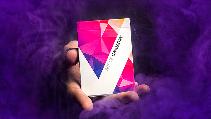
Cardistry turned the deck into a kinetic canvas. Where magicians sought invisibility, cardists embraced visibility—bold back designs that read clearly on video, symmetrical patterns that reward spins and fans, and colours graded for slow-motion clarity on social feeds. The audience is not a spectator at a table; it is a camera sensor and a scrolling thumb, and that shift rewrote the design brief for an entire category of decks.
Design constraints you can feel
Designers now collaborate directly with performers before a tuck ever goes to print. Stocks are chosen for durability through packet cuts and springs; finishes balance slip and block separation so isolations do not "stick" mid-line. Borders disappear or explode into full-bleed abstraction depending on whether the routine rewards a defined frame or a floating field of colour. Corners, traditionally rounded for casino handling, are debated thread by thread because a fraction of a millimetre changes how a packet sounds when it lands.
Typography on custom decks often steps back: the face may stay standard for recognition while the back carries the art direction. Some releases invert that logic with fully custom courts aimed at collectors who will never table the deck. Cardistry sits in the middle—faces still need to be readable in flashes, but backs carry the burden of identity.
Community, drops, and the speed of taste
Limited runs sell out in minutes because the community studies prototypes on Instagram and Discord the way sneakerheads study leaks. Numbered seals, holographic stickers, and collaborative logos turn scarcity into a social signal: owning batch 014/500 is a participation trophy in a global club. That economy rewards bold graphics and punishes lazy reprints, but it also pressures artists to iterate faster than traditional print schedules prefer.
Critics sometimes dismiss the scene as hype; practitioners point to the hours of rehearsal behind a fifteen-second clip. Either way, the market is real—secondary prices spike on perceived handling breakthroughs, not only on rarity. A deck that "breaks in" beautifully can outrun a prettier tuck that clumps after an hour of cuts.
Film literacy and the new classicism
Slow motion changed aesthetics. Motions that looked muddy at thirty frames per second become sculptural at two hundred forty. Designers now anticipate ribbon spreads that will be frozen, colour bands that will be colour-graded, and noise patterns that must survive compression. In that sense cardistry decks are already "video-native" products—an odd parallel to how movie poster design shifted when thumbnails became the first audience touchpoint.
Yet classic virtues persist. Balance, negative space, and a coherent colour story still separate memorable backs from busy ones. The best modern work borrows from poster art, textile repeats, and even brutalist geometry without forgetting that the object must survive being dropped, bent slightly, and shoved into a jeans pocket between sessions.
Collecting with intention
Collecting cardistry decks is as much about supporting artists as owning objects. Signatures, gilded edges, and embossing turn functional tools into display pieces. Whether you film cuts or keep decks sealed, you are voting for a creative supply chain that treats pasteboard as legitimate illustration—not a disposable promo.
At TurretDecks by Sterling Thames Media we cheer that shift: when a deck exists to move beautifully in open light, the whole industry pays more attention to ink, varnish, and grain direction. The modern era proves playing cards were never only for play—they are moving illustration, one flourish at a time.